

Kishi
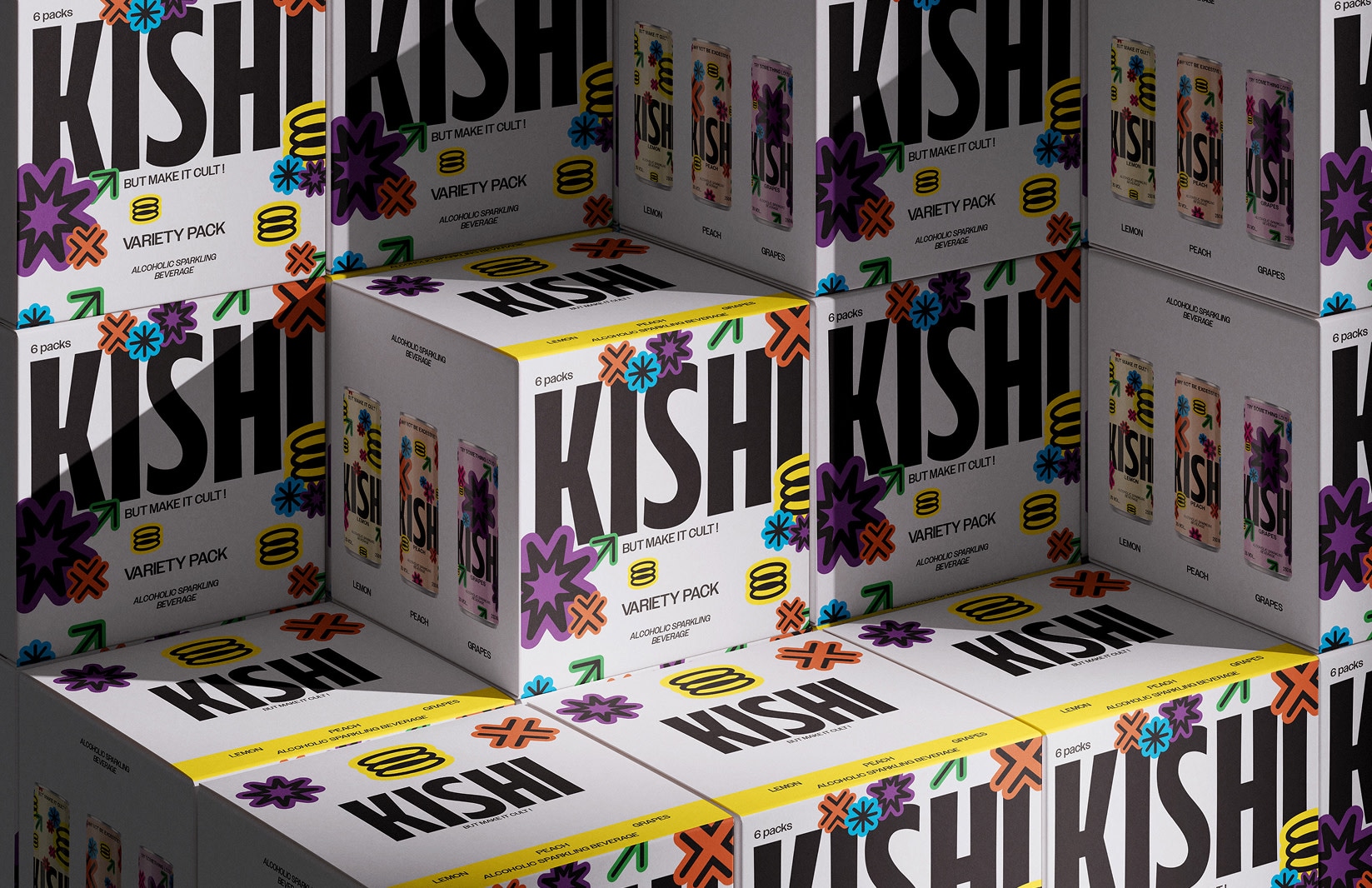
Visual identity and packaging
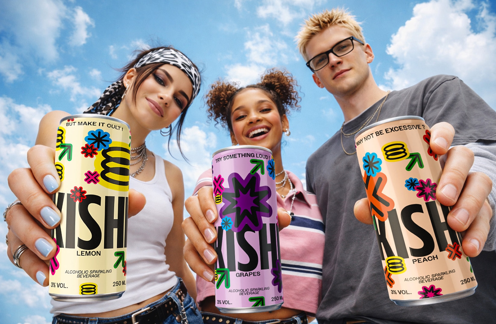
KISHI is a brand design project around a fictional sparkling alcoholic drink aimed at a young urban audience. The objective was to explore the creation of a strong visual identity and a contemporary advertising universe capable of positioning the brand within lifestyle culture.
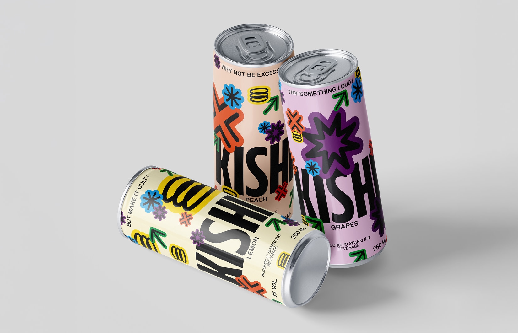
The cans use a colorful and dynamic graphic design composed of abstract shapes, arrows and pop symbols. The different flavors, lemon, grapes and peach, are distinguished by vibrant palettes that help build an immediately recognizable visual system.
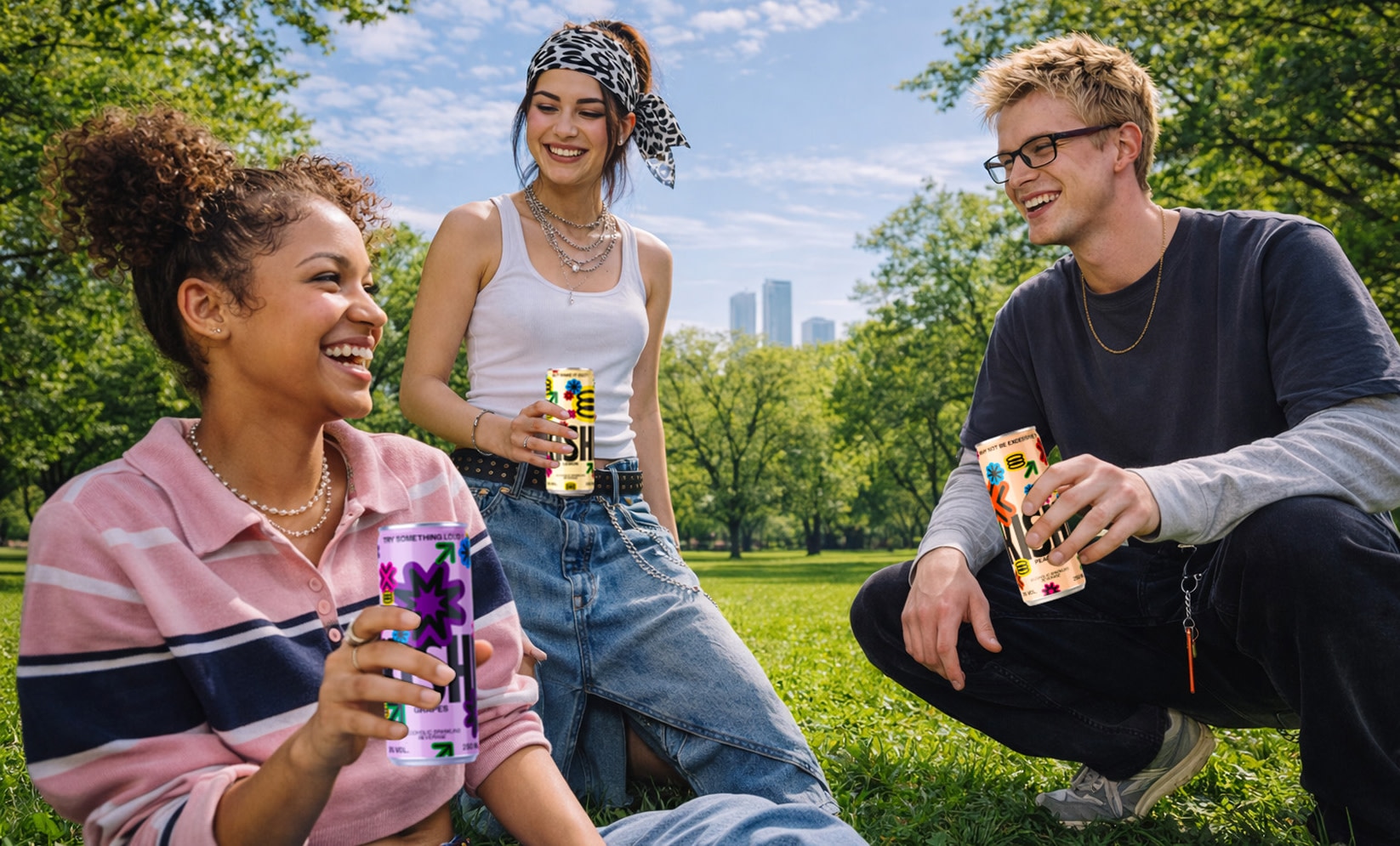
The campaign features a group of friends moving through different urban environments and everyday moments. Through these scenes, the product becomes part of a broader social and visual universe, mixing energy, spontaneity and street culture.
The campaign images were generated with artificial intelligence tools and then refined through retouching to build a coherent and credible universe. This hybrid approach made it possible to explore different compositions and situations quickly while keeping creative control over the final result.